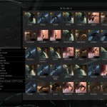
Yesterday CCP has deployed long-awaited EVE Online expansion called the Inferno. It has brought many changes: new missile engine, many new models and launchers. It has also brought a new Inventory UI. In most RPG games inventory is one of the most important features, and for sure most extensively used. It is no surprise then, that some players are opposing big changes like this one. I have played a lot on Singularity over the past few weeks, so the new inventory was not a surprise for me. I have also noticed many pros of the new system:
- It is much harder to put items accidently in a container, instead of Hangar floor,
- It is much easier to tell which POS structure hangar I am interacting with (previous windows did not indicate the structure name),
- It is easier to manage hangars with lots of containers (like mine)
- You can move items by dragging them to the tree on the left
- I now know that my entire ship collection is easily worth as much as a Nyx
- New Inventory shows how much space would items on the hangar floor take
- You can create your own custom filters
Unfortunately, not everything is so usable.
- Viewing wrecks seems to be a regression; opening multiple wrecks quickly fills the tree, making it unusable. Previous approach with a small loot window and a big “Loot All” button was much better. It was not only usable, but was also pretty much consistent with many other MMO games. Of course you can still do this – if you press “Shift” when clicking “Open wreck”.
- The currently active ship vanishes from the Ship Hangar (@CCP_Arrow has confirmed this is a bug)
- Even though new UI shows the structure name, it becomes cluttered when managing a POS with multiple labs/manufacturing arrays
- Managing Turret batteries has become a real pain. CCP has confirmed they 1) will group structures by type 2) will allow any structure to have a specific name
I think the solution would be to let the player configure which windows should open in new window by default, and which should open in an existing view. It would also work if the client “remembered” which windows were “detached” from the main inventory window.
The EVE blogoshpere has many different views on the topic. There are two must-reads on Unified Inventory:
- Seismic Stan’s post: “Inventory Unified, Players Divided”
- and an excellent post by Tippis: The Shift-Click, it does nothing!
To sum up what was said: the new Inventory is a brilliant idea that needs a bit of polish before it becomes just as usable as the old one. I hope CCP will use player feedback to improve and iterate on it.

