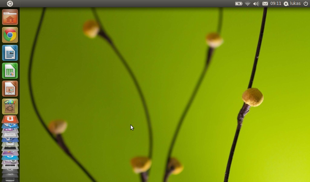
 About two months ago Jack Wallen has posted a nice comparison of GNOME and Unity on techrepublic.com. I really recommend reading this text, because it compares the old Unity from Ubuntu 10.10 with GNOME, and also points out is weaknesses. This post is a quick review of the new Unity, which comes included in the recently released Ubuntu 11.04. We will try to see if and how Ubuntu developers responded to feedback from users.
First contact
First off, there will be no first contact at all, if your X-Window cannot use hardware acceleration. If you installed the new Ubuntu on a virtual machine, or need additional drivers for your video card, you will see GNOME as a fallback default.
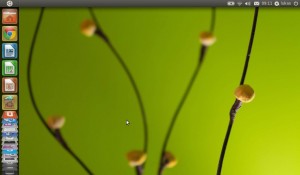
Unity itself looks almost unchanged. Some minor adjustments were made to the Launcher (ribbon on the left) and icons themselves, but otherwise it looks and behaves just the same. Well, almost. Users have complained, that the Launcher takes valuable space on the left side of the screen, which on small netbook displays is rather a waste. Canonical must have heard about this, because now the Launcher bar will hide every time an application runs in a full screen. If you need to start another program, all you need to do is move cursor to the left side of the screen – Launcher will appear right away. Problem fixed? Yup, I think so.
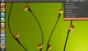
Another familiar element is the top right corner, where all the status icons, clock and logout button are located. They also preserve the integrations with many programs, just like they did in GNOME. So, the speaker icon is not just the volume indicator, but is also integrated with Banshee and Rhythmbox music players. Similarily, the envelope icon is not just for mail, Gwibber (social networks client) is also linked here.
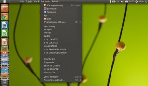
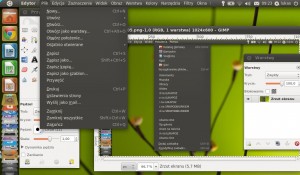
Also, new Unity has borrowed from Mac OS X: most programs can have their menu integrated with the top status bar – once you move cursor up there, a menu will appear, just like it does on a Mac. It is another good spacer saver. If you do this with an empty desktop, you will see a menu with familiar Places item, which did not exist in the old Unity, and used to be another problem for users – connecting to remote filesystems. In the current version it behaves just like the Places menu in GNOME, so one more deficiency has been filled.
Starting and installing programs
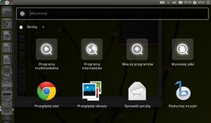
I got used to GNOME’s Programs menu, which is clear, compact and reminds the Windows start menu (most users are accustomed to it). This is probably the biggest change in Unity, when compared to other desktop environments. When you click the top left Ubuntu icon, a Dash window with program groups and docs finder will appear. It is possible to choose from multimedia, internet or other apps. It also allows to look for files and documents. Once a category has been chosen, the top row will show favorite and most used applications. The next row contains all installed apps in the category. The last row contains… programs which can be installed. This allows users to install all programs they need very smoothly, without the need of opening a web browser or package manager – just click an icon, and the Package Manager will allow you to add the desired package to your system. It’s that easy!
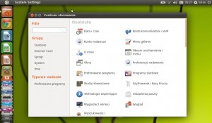
It was not necessarily obvious how to enter the Settings panel, and some users complained about that. To enter System Settings just click the logout button in the top right corner – System Settings is the last item on the list. Still not an obvious location, but it is still much easier than it was in previous version. Personally I would see it in the top desktop menu, just next to Places.
Space savers everywhere
Extra desktop space is always handy – especially on netbooks. Canonical did not end their job here – the new window manager theme has reduced all sliders to a few pixel wide border, which shows a handy slider once you hover cursor over it. Another 20 pixels saved!
Overall experience
I did not use Unity as my default desktop in Ubuntu 10.10, because it lacked a few important functions. GNOME is after all much older and already rather mature environment. What happend to Unity can be easily described with one word: Evolution. I am positively surprised with the way things evolved, and so far I have been using Unity as my main desktop manager since upgrade to Natty last week. Users complained, and Canonical listened. On a side note, similar process was happening recently in EVE Online (small, useful adjustments requested by the users). In both cases it seems to lead in a good direction, so let’s keep up good work!
PS. If you love GNOME and don’t want to switch to Unity, you can choose to use Ubuntu Classic at login time


