Yesterday Microsoft has released the second public beta-version of the new Windows 8. I have downloaded both the 32 bit and 64 bit versions of Windows 8 Consumer Preview for testing – you can download them for free from Microsoft’s website: http://windows.microsoft.com/en-US/windows-8/iso
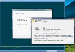
VMware Server 2.0.2 installation
INCOMPATIBLE
Unfortunately, Consumer Preview behaves just the same way as Developer Preview did – the adventure with 32 bit version ends pretty quickly with a BSOD immediately after booting the virtual machine (error message shows HAL_INITIALIZATION_FAILED). Since I have no 64 bit host available, there was no point in testing the 64 bit guest.
I will try VMware Player 4 and Oracle Virtualbox 4 later on, so feel free to bookmark this page and come back later.
VMware Player 4.0.2
COMPATIBLE
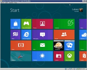
There was no issues with installing Windows 8 on VMware Player 4. I have tried both 32 and 64-bit versions, both install without a problem. It is worth mentioning that in VMware Player 4 the seamless mouse integration works without installing VMware Tools in the guest operating system. The performance of the virtual machine is surprisingly good – animations are nearly fluent.
VirtualBox 4.1.8
COMPATIBLE
Windows 8 install works just fine – I have installed and tested the 32-bit flavour. I have also noticed, that using your Windows Live! ID on more than one computer will synchronize the look and feel of Windows between these computers. If you click a confirmation link in an e-mail, which comes shortly after the installation, you will be able to use this computer to recover your Live! ID password. Similar to VMware Player, both the mouse integrations and machine performance work very well without installing VirtualBox Guest Additions.
Bare Metal installation – Desktop PC
I have tried to install the 64 bit version first on the following machine:
- Intel Core 2 Quad Q6600 (2.4 GHz)
- 4 GB DDR2 RAM (OCZ)
- DFI Blood Infinity P35
- nVidia GTX 550Ti 1024MB GDDR5
Unfortunately the installer failed at 21%, throwing a “Cannot copy windows files” error. At this point I have no way of telling if this is a problem with the download or the ISO itself.
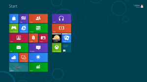
I had more luck with the 32 bit version. Since my PC is already 4 years old, it’s not a surprise that Windows 8 did not ask me for any drivers. This is what I saw after booting the installed system and logging in with my Windows Live! ID account:
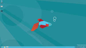
Besides a different background it looks almost the same way as the Developer Preview did. Let’s have a look at the desktop then, maybe we spot some differences there:
No kidding! Menu Start is indeed, history. How do I get back to the Metro Start page? I have quickly found out, that you just need to move the cursor to the lower left corner. Click. That’s it! Simple, isn’t it? Maybe other corners hide some features as well?
Both my inner geek and my inner explorer were quite excited at this point.
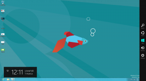
So, both corners on the right side of the screen trigger the “settings” sidebar (those sidebars are called “Charms“).
The first icon is desktop Search: it will look for a file or program with the specified name, but also for programs available in the Store. “Share” allows to share files with other users. “Start” will bring you back to the Metro Start Page. “Devices” allows to safely remove hardware such as USB sticks or hard drives. “Settings” is app sensitive. It will allow you to shut down or reboot your Windows, reach the Control Panel (it’s Metro counterpart is just called “Settings”) or access app-specific settings. Some apps, like Internet Explorer 10, have two more Charms: bottom and top (for address bar and navigation icons).
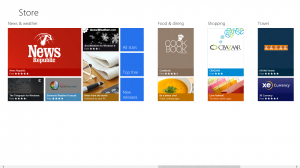
But where do one gets apps from? And this is another new feature of the Windows Consumer Preview: from the Store:
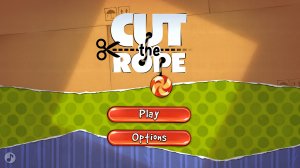
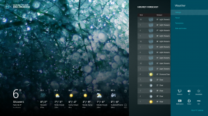
Yes, this is the well known “Cut the Rope” game, now also available for your Windows 8. All apps available right now are free and Metro-enabled. The new UI is more like what we are used to on tablets and mobile phones. For example, the Weather app looks like this:
Here you can also see the app-sensitive settings available from the top.
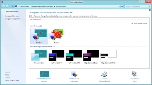
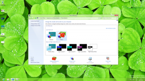
Let’s get back to the Desktop and see if any features known from Windows 7 are still there. It seems, that customization options are very similar – almost the same. It is possible to change the Aero color, desktop background or show/hide My Computer, My Documents and Network icons:
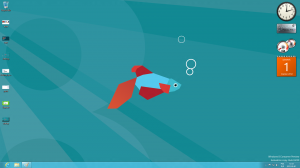
Gadgets are also available, so if you liked them in Windows 7, it is still possible to use them in Windows 8:
As you have probably noticed this far, everything in Windows 8 is shaped as a perfect rectangles. Microsoft left all the rounded corners for Apple and made a very distinct look and feel. Surprisingly, it feels very natural – Metro UI is quite useful. The small app tiles on the Start Page will display information once the corresponding app is started, so information like weather or recent tweets are visible right away, without the need to open the app. Old programs run seamlessly in the desktop mode, while the new ones run in Metro mode.
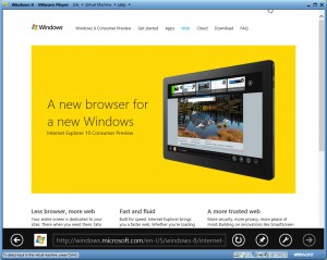
Internet Explorer 102
The default internet browser now comes in two flavours: Metro and Desktop. And no, this isn’t just two UIs for the same program. These are two different applications with separate settings , bookmarks and cookies. Log on to a website with the Desktop one, you will have to login again if you switched to the Metro IE. IMHO this should be unified before releasing Windows. Otherwise how would you synchronize a Windows 8 tablet with a PC, if it’s impossible to sync the two browsers on the same PC?
I have three distinct feelings after an hour with Windows 8:
- I have almost an urge to mash the ESC key to exit a Metro app back to Start Page – I don’t know why it feels this way, but I’d see one key to exit back to Start Page. It feels so natural!
- There is no way to quickly kill all running apps. You have to use the Task Manager. A screen with all running apps would be great. So far we only have the alt-tab:

- If I had a Windows 8 tablet, Windows Phone powered mobile, an XBOX 360 console and Windows 8 on my desktop, the experience would be very much like iOS, Mac OS X and iCloud. Good job on catching up, Microsoft!
Overall impression
Microsoft managed to get all of us excited – something usually reserved for Apple. In comparison to Windows 8, Mountain Lion looks a bit pale: Windows 8 is a new experience, a revolution similar to Windows 95, while new Mac OS X only brings some cosmetic changes.
One more thing that came to my mind is Unity interface introduced (and iterated upon) in Ubuntu 11.04. It seems that every major OS brings its own distinct look and feel, breaking the “windows-like” trend observed after the release of Windows 95.
One more thing: EVE Online
![]() I would not be a dedicated EVE Online player if I haven’t tested the compatibility of our favourite game with the new Windows. So I have started EVE, and… I saw the Splash, and then it crashed.
I would not be a dedicated EVE Online player if I haven’t tested the compatibility of our favourite game with the new Windows. So I have started EVE, and… I saw the Splash, and then it crashed.
…FAIL!
Unfortunately I didn’t have much time to debug it and find what the issue is. Will try again after installing nVidia display drivers instead of Microsoft’s ones.
INCOMPATIBLE?


